

View pictures in App save up to 80% data.
Walmart is known not for making rash, sudden, bold moves. Rather, its M.O. is to deliberate on big changes it makes, a strategy that has generally paid off over time for the largest U.S. retailer.
Walmart's recent logo update, its first in almost 17 years, aligns perfectly with the company's brand identity, featuring only slight modifications that may go unnoticed by the casual observer. The refreshed design showcases bolder lettering for "Walmart" and wider stems on the accompanying yellow sun-inspired spark graphic, which is increasingly prominent in the company's marketing efforts.
Walmart's marketing chief aimed not to completely change the logo, but to give it a modern update that aligns with the company's significant focus on e-commerce and digital services. The goal is to position Walmart as a more stylish brand that attracts a broader range of U.S. consumers, particularly those with higher incomes, while still retaining the loyalty of its existing customers.
"I wouldn't call this a rebrand, but really a refresh to reflect who we are today," Walmart U.S. Chief Marketing Officer William White tells Fortune. "The Walmart of today is very different than the Walmart of 2008, the last time we made a change in the brand identity. We are more modern, we are more digital." In 2008, Walmart eliminated the dash in its name and logo—"Wal-Mart"— that for decades since its 1962 founding had been its trademark.
The background now features a richer shade of blue, while the yellow in the sparkle has become more vibrant, and the Walmart lettering in the logo appears bolder and more pronounced. Although these adjustments may not cause passersby to halt in their tracks, they do give the logo a more contemporary and refreshed appearance.
"According to White, 'The modifications are significant as they infuse more vitality and energy into the spark, enriching it and adding depth.' The updated appearance will be rolled out online this month and gradually introduced in physical stores."
The previous logo (above) and the updated logo (below):
View pictures in App save up to 80% data.

View pictures in App save up to 80% data.
One of the ways in which Walmart has been trying to project modernity hipness has been through the apparel it sells. The emphasis used to be pretty much solely on low prices for basic items. But in recent years, Walmart has borrowed some moves from rivals like cheap-chic rival Target and the department stores to raise its fashion game. As detailed in a Fortune feature in June, Walmart for instance now uses visual merchandisers to showcase clothing with mannequins in its stores rather than just piling up clothes with basic signage showing everyday low prices. Moves such as those, and offering more organic food, have been key to helping Walmart win more business from households with income of more than $100,000 and thus outperform rivals with a 5.3% increase in comparable sales last quarter.
Nevertheless, White faced the challenge of making subtle adjustments to position Walmart as a more modern and appealing option for tech-savvy consumers, while being careful not to stray too far from its core identity. The risk was that such changes could confuse or even alienate the loyal shoppers who primarily choose Walmart for its affordability and essential goods. After all, maintaining a sense of consistency is a message in itself.
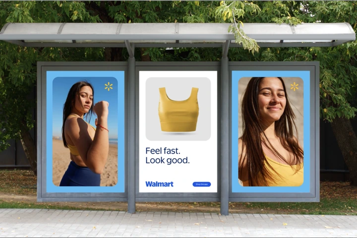
Walmart has been making a fascinating change in its branding strategy by increasingly featuring just the iconic yellow spark in its advertisements, often without any accompanying text, including the name "Walmart." Last year in New York City, a place where Walmart doesn't have any stores, some bus shelters displayed advertisements for fashionable items sold by Walmart that only included stylish images of the clothing along with the spark. This approach aims to gradually alter shoppers' views, moving away from the perception that Walmart is solely a provider of low-cost, mass-produced goods. "It is prompting a re-evaluation of who Walmart is and the variety of products we offer," states White, who became Walmart's Chief Marketing Officer in 2020 after a lengthy career at Target.
View pictures in App save up to 80% data.
Walmart's aspiration is that its revamped spark will achieve the same level of recognition for the brand as Starbucks' mermaid, Target's bullseye, and Apple's apple do for their respective companies.
"We aspire to present ourselves like the legendary brands," White states. "Our goal is for the spark to serve as a guiding light for the Walmart brand," he adds.
This story was originally featured on Fortune.com